
What are IG fonts used for?
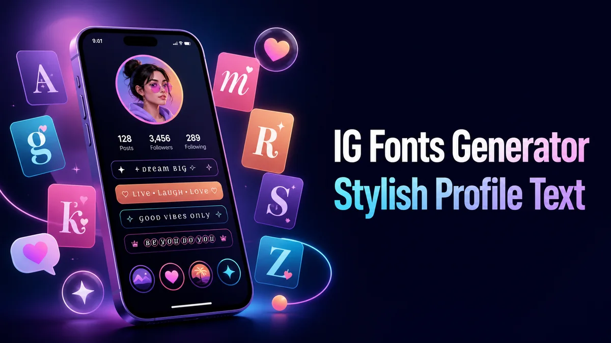
IG fonts are copied Unicode styles for Instagram bios, captions, story text, and short profile labels. They change the characters in your text, while Instagram controls the final spacing and layout.
The best result is short and easy to scan. A story sticker needs a different width from a bio line, so compare the full phrase in the place where followers will read it.
How do you choose an IG font for each Instagram surface?
A bio, story sticker, caption, and comment have different reading conditions. Make a short version for the exact place where people will see it.
Step 1: Choose the Instagram destination
Decide whether the words belong in a bio, story sticker, Reel cover, caption opener, or comment. The destination sets the right length.
Step 2: Enter the final wording
Type the phrase with its real capitals, spaces, and punctuation. This prevents a mixture of unfinished plain and styled text.
Step 3: Compare a safe and expressive style
Check bold or small caps first, then compare a wider or softer option. Keep the phrase short enough for the smallest screen.
Step 4: Paste and read it in Instagram
Place the result in the correct editor and check it with the photo, video, or profile image. The live view is more useful than the generator card.
What should you write before choosing an IG font?
Write the final phrase in ordinary letters first. Include the punctuation, capitals, and spaces that you will publish because these details change the balance of every result.
Then decide whether the line is for a profile, a story, or a caption. That choice tells you how short and how decorative the result can be.
Do IG fonts display the same way on every phone?
No. A phone may use a different fallback character, trim spaces, or show an unsupported symbol as an empty box.
Check the line in the Instagram editor and after saving. If the width changes, choose a common bold, small-caps, or frame style with fewer unusual characters.
What are the advantages and drawbacks of IG fonts?
IG fonts can add a quick visual cue without asking you to design an image. They also help separate a profile headline from the explanation below it.
Long converted text becomes harder to scan and may not match ordinary search terms. Keep the subject, offer, and action in plain text so the style does not carry the whole message.
How should an IG font change by surface?
A bio is read beside the account name, so its first line should explain or support the profile. A caption is read beside an image, so the styled part should introduce the post and leave the main message plain.
Story text has the shortest viewing time. Open letters work better over a moving background than narrow script. Also, a frame may disappear when the sticker is resized, so keep the phrase short.
- Use a short headline in a story sticker.
- Keep hashtags and topic phrases plain in captions.
- Check the result with the final image or video.
Why can an IG font look different after posting?
Instagram adds its own line height, wrapping, and sticker controls after you paste the text. The same characters may take more room when you move the sticker or when the published layout replaces the editor view.
Search is another concern. Unicode lookalikes can look like normal letters to a person but remain different characters to search systems. Keep the topic, offer, and call to action in ordinary text.
- Check the text after the sticker is resized.
- Look for empty boxes or unexpected spaces.
- Keep searchable words in normal characters.
Tip: The right IG font is the one that stays clear after Instagram adds its layout, image, and sticker controls. Keep a few short versions instead of forcing one style into every surface.
How should you check an IG font before posting?
Read the line beside the account image and the other caption text. A result that looks clear in the generator may become too wide when Instagram adds its own layout.
Keep the plain phrase in your draft. If the app changes the result later, you can create a new version without retyping the message.
Keep one plain version and one short styled version of the phrase. Test the styled copy with the final photo or story background, then remove any character that looks like a box or makes a familiar word hard to read.
What should you confirm before using IG Fonts Generator?
Use an IG font for a short bio line, story heading, or caption opener. Paste it into the real Instagram surface and check the width, line break, and contrast before publishing.
Keep the subject, location, username, and call to action in plain text. The styled phrase should introduce the post, not replace the information people need to understand it.
Related tools: Fonts for Instagram , Cool Instagram Bio Maker and Aesthetic Fonts Generator .