
What are Instagram fonts?
Instagram fonts are copied Unicode characters that give a bio line, display name, caption, or story label a different look. They are not installed fonts. The characters travel with the text when you copy and paste them.
A short style can make a profile easier to scan, but it should not hide the account topic. This guide explains where Instagram font styles work, what to keep plain, and how to check the result before publishing.
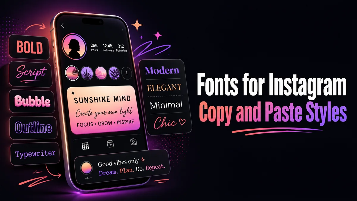
How do you use Instagram fonts in a bio or caption?
Instagram bios are short, so use the generator for one clear line and keep the information visitors need in normal letters.
Step 1: Write the bio in normal text
Finish the wording before you style it. Include the account topic, name, location, offer, and next step so the bio makes sense without decoration.
Step 2: Choose one line to style
Pick a short greeting, role, or identity phrase. Bold, small caps, and a light frame are usually easier to read than a full script alphabet.
Step 3: Paste the result into Instagram
Copy the styled line and paste it into the bio editor. Keep the other lines plain, then check the character counter and the line breaks.
Step 4: Read the saved profile
Open the profile as a visitor and look at it on a phone. Remove any character that becomes a box or hides the account topic.
Which Instagram words should stay plain?
Keep the account topic, name, location, service, and main search terms in ordinary letters. Those words tell visitors what the account offers and are easier to copy from a phone.
Use the styled result around that information. For example, a photographer can style a short phrase such as “visual stories” while keeping the location and booking details plain.
Do Instagram fonts work in every profile field?
Instagram fields do not all handle copied characters in the same way. A result may work in a bio but wrap badly in another field, so the saved profile is the final test.
Check the line on a phone as well as a desktop screen. If a character becomes a box or the useful words disappear, move to bold, small caps, or a simple frame.
What are the benefits and limits of Instagram fonts?
A short styled phrase adds a clear starting point without needing an image. It can separate an identity line from the details below it.
The same characters can reduce search clarity, change line wrapping, or sound unusual in assistive technology. Keep a normal copy of the words and use the style as a small visual layer.
What is the difference between the Instagram name and username?
Instagram has a display name and a username. The display name appears on the profile and can explain who you are. The username is the account address that people use in search, mentions, and links.
Keep the username and at least one important word in ordinary letters. If the name field contains a niche or location, leave those terms plain too. Use the styled result for a short phrase that adds personality around the useful details.
- Keep the account subject easy to recognise.
- Use line breaks for the role, offer, and next action.
- Use the styled line as an accent, not as the whole bio.
How can you keep an Instagram bio easy to edit?
Save the normal wording in your notes before you copy the styled version. Later, you can change a date, service, or link label without trying to edit unusual characters one by one.
Paste the bio on a phone and on a larger screen. A line that looks balanced on desktop may wrap beside the profile image. If that happens, shorten the styled phrase instead of shrinking the whole bio.
- Keep a plain copy of every line.
- Check the bio after Instagram saves it.
- Remove extra symbols before removing useful words.
Bio is 150 characters
Combining styles like strikethrough add a hidden mark per letter, so the counter can run out sooner than expected.
Username stays plain
Letters, numbers, periods, and underscores only. No style here will save in that field.
Keep keywords readable
Styled letters are not matched as normal letters, so your niche or location should stay in plain text.
Tip: Instagram font styles work best as a small part of the profile. Keep the account identity and useful keywords plain, then let one styled line set the mood.
How should you review an Instagram profile before publishing?
Open the profile as a visitor and read the name, bio, and link in that order. You should understand the account before the decoration catches your eye.
If the styled phrase pushes the topic or next action out of view, shorten it. A smaller effect is usually more useful than adding another symbol.
Read the finished bio without the profile image. The account should still be clear from the words alone. If the styled line hides the topic, location, or next step, shorten the style and keep the useful terms plain.
What should you confirm before using Fonts for Instagram?
Use fancy text for a short Instagram bio line, profile heading, or caption opener. Paste the full result into Instagram and read it beside the profile photo or the rest of the caption.
Keep the username, name field, niche, location, and link text plain. Use the styled line as a small visual accent so visitors can still understand and search the profile.
Related tools: IG Fonts Generator , Cool Instagram Bio Maker and Fancy Bio Generator .