
This Stylish Text Generator turns ordinary words into copy and paste text for bios, captions, display names, status lines, and short messages. It is useful when the app you are using does not offer a bold, italic, small caps, or decorative text control.
The result is not a downloadable font and it does not change the typeface installed on your device. Instead, the generator maps supported letters to Unicode characters that resemble a chosen treatment. That difference explains both its convenience and its limitations.
The visual treatment often travels with the copied string, although the receiving app and device still decide whether each character is displayed, counted, searchable, or accepted. Therefore, the final destination should always be part of your selection process.
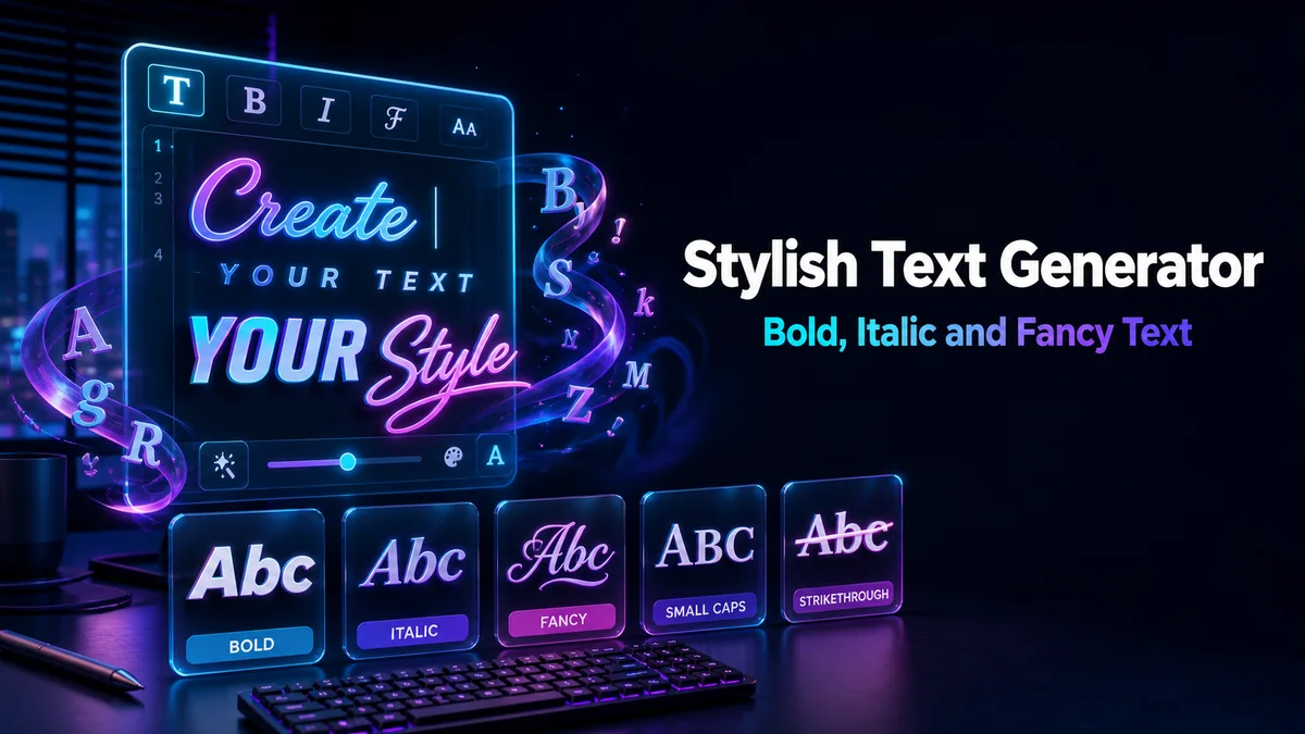
What is stylish text and how does it work?
Stylish text is ordinary wording represented with alternative Unicode characters or added symbols. A bold result may use mathematical letterforms, while a strikethrough result keeps the letter and adds a combining mark. A frame may leave every letter unchanged and place symbols around the phrase instead.
Because these are characters rather than formatting instructions, the style can remain visible in a profile field that has no rich-text toolbar. However, search tools, screen readers, form validators, and character limits may treat the result differently from plain English. Use the visual treatment for emphasis, then keep important information in normal characters.
How do you create a stylish text line with this generator?
The safest workflow starts with finished wording and ends with a check in the real destination. That sequence prevents you from editing a decorated string, losing a symbol, or choosing a result that does not fit the final field.
1. Enter the wording you plan to publish
Type the complete phrase into the input, including spaces, punctuation, numbers, and capital letters. The preview updates as you type, so you can compare the exact line instead of judging a sample word. Keep a plain copy before styling it, especially if the text will be reused in a bio or profile.
2. Compare letter treatments with symbol frames
Letter styles change the characters themselves, while frames add symbols around a mostly familiar base. Compare both at the size of the destination. Small caps and light bold are usually easier to scan across a sentence, while wide, script, or ornate styles are better for a short title.
3. Copy the complete result from its card
Use the Copy button attached to the result you want. Manual selection can miss a combining underline or include the label beside the preview, particularly on a phone. After copying, paste into a temporary note once so you can confirm that the full string travelled to the clipboard.
4. Check the saved version in the destination app
Paste the result into the actual bio, caption, message, or display-name field. Then inspect the saved view, not only the editor. Some apps trim repeated spaces, replace unsupported glyphs, change line breaks, or count combining marks separately. If the result changes, choose a simpler style before publishing.
Which stylish text suits a bio, caption, or message?
The purpose of the field should determine the amount of decoration. A short profile name can carry a stronger visual treatment because readers expect an identity label. A caption needs a clear opening, while a chat message should remain quick to read during a conversation.
Keep links, contact details, instructions, searchable names, and numbers used for calculations in plain letters. You can style the heading around those details. In this way, the design catches attention without making the useful information difficult to find, pronounce, copy, or edit.
How is Unicode text different from real formatting?
Real formatting stores ordinary words plus an instruction such as “show this in bold.” The destination app can apply, change, or remove that instruction. Unicode text works differently. The copied string already contains alternative characters, so an app with no formatting toolbar can still display the visual effect.
That is the main advantage and the main limitation at the same time. The style can survive a simple paste, but the string may no longer behave like ordinary letters for search, accessibility, sorting, validation, or calculations. Use it as a visual layer rather than as a replacement for every plain word.
Which styles remain readable across a longer line?
Readability usually drops as decoration increases. For a sentence or a longer profile line, begin with a treatment that keeps familiar letter shapes and avoids dense symbol clusters.
- Small caps preserves a familiar rhythm and often works well for a short heading or profile line.
- Bold and italic create clear emphasis, although individual glyph coverage still varies by device.
- Simple spacing changes the rhythm without replacing every letter, so it can suit a calm display name.
- Wide, script, and gothic styles are stronger visual choices for short phrases because they can become tiring across a paragraph.
- Strikethrough and underline add combining marks, which makes them useful for a deliberate effect but less suitable for strict character limits.
Where can stylish text create compatibility problems?
Compatibility becomes important whenever software needs to search, calculate, validate, pronounce, or moderate the characters instead of merely displaying them to a reader.
Search is the clearest example. A keyword written with alternative characters may look like the normal word, but the underlying string can be different. As a result, a caption may not appear for the plain search term that a person expects to find.
Account fields and forms are another risk. A styled name may pass an early screen and fail during a later validation step. Likewise, styled digits are text rather than numbers, so they should not be used in spreadsheets or anywhere that needs a calculation.
Use one clear visual accent
A styled heading surrounded by plain text creates hierarchy. Styling every line removes the contrast that makes the heading useful.
Count the complete string
Strikethrough and underline add marks to letters, so a short visible line can occupy more space in a strict field.
Preview on another device
Character coverage differs by app and device. A result that looks correct on your screen may appear as boxes elsewhere.
Why is small caps often a practical first choice?
Small caps uses alternative letterforms that usually keep the shape of ordinary reading better than a dense script or ornate alphabet. It can therefore give a profile line a designed appearance without making every word difficult to recognise.
It is not universally supported, however. Some letters may render differently, and a receiving font may lack a glyph. Check the complete phrase in the app where it will appear before you treat small caps as a guaranteed solution.
When it works, the result looks intentional rather than overloaded. That balance is useful for bios, headings, community names, and short captions that need personality without sacrificing clarity.
Tip: Style the first line of a caption or bio, then keep the searchable keywords in ordinary letters underneath. The contrast gives the reader a visual entry point without hiding the words that search, tagging, and accessibility tools need to recognise.
How do you keep a plain and styled copy together?
Save the original phrase beside the selected result and note the destination where it worked. This small record makes it easier to update a bio, caption, or profile without rebuilding the style from memory.
When the wording changes, edit the plain version first and generate a fresh copy. Editing decorated text by hand can mix different alphabets or remove a combining mark. The plain source protects search and editing, while the new result keeps the visual treatment consistent.
Which generator should you use for a name?
For a character or profile name, the Fancy Gaming Name Generator puts symbol frames, gothic letters, and team-friendly treatments first. If you have not settled on the base name, a nickname generator is the better starting point.
The full catalogue is available on the Stylish Font Generator. Roblox and Adopt Me players should also read the field and filter guidance on the Adopt Me Font Generator page before using decorative text in a game-related post.