
A stylish font generator helps you create copy and paste text for bios, captions, display names, gaming profiles, community posts, and short messages. It is useful when an app has no bold button, font menu, or formatting control for the field you want to design.
The result is made from Unicode characters and symbols, so the visual treatment can travel with the text when you paste it into another field. However, the most decorative styles are not always the easiest to read or the most widely supported. The right choice depends on the destination, the length of the phrase, and whether people need to search or type it.
Use this catalogue as a practical comparison tool. Type a phrase above, review the style groups, copy a complete result, and then test it in the profile, game field, social post, or chat where you plan to use it.
What does the Stylish Font Generator create?
It creates 1396 generated styles from the text you enter. Some replace ordinary letters with Unicode lookalikes, some place symbols around the original text, and others change the spacing or add a mark to each character.
These are not installed font files. The page transforms your input in the browser, which means you can copy the result immediately without creating an account or downloading an app.
Because the output is made from characters rather than formatting instructions, it can work in places that offer no rich-text controls. However, the receiving app still decides which characters it can display and which ones it will accept.
How do you use the Stylish Font Generator?
Use the generator as a short compare-and-check process. Type the phrase once, narrow the results by purpose, inspect the output in the result cards, and then test the exact copy in the place where you want to use it.
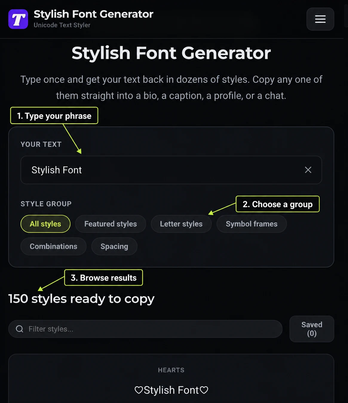
1. How do you enter the text you want to style?
Start in the Your text field at the top of the tool. It opens with a sample phrase so you can see the layout immediately, but you can replace it with a username, a short bio line, a stream title, or any other phrase of up to 120 characters. The clear button at the right of the field removes the sample when you want to start with an empty input.
The previews update in the browser as you type, so you do not need to submit a form or wait for a separate results page. For the clearest comparison, enter the phrase exactly as you plan to publish it, including spaces, punctuation, and capitalization.
2. How do you choose a style group?
Once the phrase is in place, use the group buttons to change the kind of result you are reviewing. Each group solves a different design problem, which makes the list easier to scan than one long stream of unrelated previews.
- All styles shows the full collection when you want to browse without a preference.
- Featured styles brings together ready-made accents for short names that need personality.
- Letter styles changes the shape of the alphabet with treatments such as bold, script, gothic, and small caps.
- Symbol frames keeps the original letters more recognizable while placing symbols around them.
- Combinations pairs a letter treatment with a frame for a stronger visual effect on a short line.
- Spacing separates letters or words with spaces and symbols when a lighter treatment is more useful.
If you are choosing a name for a fast-moving chat or a game lobby, begin with Letter styles or Symbol frames. If the phrase is decorative and brief, Combinations can add contrast, while Spacing is a sensible first check when compatibility matters more than ornament.
3. How do you compare the generated results?
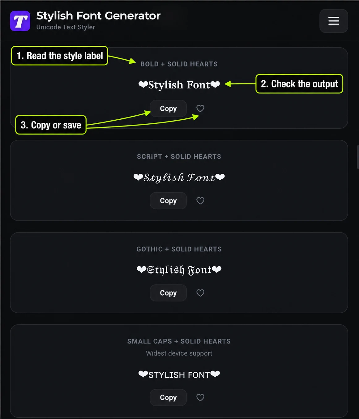
The results area starts with 30 cards so the page stays easy to scan. Each card identifies its style, displays the transformed phrase, and provides a Copy button. Some cards also include a short note that explains the treatment, which helps you understand why two previews that look similar behave differently.
To narrow a large group, use the Filter styles... field above the cards. It searches the style names rather than changing your phrase, so you can look for a specific treatment and keep the same input in place. When you find a promising result, use the heart control to save it locally and return to it later from the Saved control.
4. How do you copy the version that fits the destination?
When a result feels right, select its Copy button rather than copying a nearby label or preview by hand. The control places the exact generated characters on your clipboard, preserving the symbols and spacing that make the result look the way it does in the card.
Next, paste the result into the real profile, message, title, or name field. This final check matters because the generator can show a character that the receiving platform later rejects, strips out, or renders differently. If the field accepts it, save the result in the tool as well as in your destination so you have a convenient copy for future edits.
5. How do you keep a plain fallback?
A polished result is not always the safest result. Keep the ordinary spelling nearby when the text must be searched, read by assistive technology, typed by another person, or reused in a strict account field. Small caps, bold, simple spacing, and light symbol frames are often easier to test than ornate or heavily combined styles, although the receiving app still makes the final decision.
This approach also prevents a common mistake: choosing a style because it looks impressive in the preview, then discovering that friends see empty squares or that a game removes half of the characters. A plain fallback keeps the meaning intact while the styled version supplies the visual emphasis.
How do you choose a style without reducing readability?
Start with the job the text needs to do, not with the most eye-catching preview. A name that can be recognized quickly is more useful than one that only looks impressive at full size.
- Decide what must be understood first. If people need to search, remember, or type the text, begin with small caps, bold, or a light frame.
- Keep the styled phrase short. One name, title, or opening line usually creates a clearer contrast than a whole paragraph in symbols.
- Compare the plain and styled versions. If you cannot read the output at a glance, the design is asking too much from the person receiving it.
- Check the real destination. Paste the exact result into the profile, chat, or name field before you save anything that is difficult to change.
Where can you use the generated text?
Short profile text is usually the easiest place to start. Bios, display names, captions, Discord messages, and video titles give you enough room to test a style without making it responsible for a login, a search term, or an account identifier.
Account handles are more restrictive. They are often unique identifiers, so the platform may allow only plain letters, numbers, and a small set of symbols even when the public display name accepts Unicode.
Games vary even more. A display name, clan tag, and login ID can all have different rules, so a style that passes in a profile may still be refused in a rename field.
Good places to experiment
Use a short styled line in a bio, display name, caption, chat message, thumbnail title, or community post.
Places to verify carefully
Test account handles, game IDs, search fields, forms, and any field with a strict character or moderation rule.
Why can a style look correct here but fail elsewhere?
Unicode coverage is not identical across operating systems, apps, and older devices. If the receiving font has no glyph for a character, the result can appear as a square, a question mark, or a missing mark.
Combining styles have another limit. Strikethrough, underline, slash, and overline add a separate mark to each letter, so a field may count more characters than the visible line suggests.
Search and accessibility also depend on ordinary letters. A styled keyword may not match a normal search, while a screen reader may announce a mathematical or symbolic character instead of the word you intended.
Tip: Keep the plain spelling beside any decorative version when the text needs to be searched, copied by hand, or understood by assistive technology. That small bit of redundancy makes the design more resilient without taking away the visual accent.
How do you keep a plain and styled copy together?
Store the original phrase beside the version you paste into a profile, caption, game field, or message. The plain copy makes later edits simple, while the styled copy shows the exact visual treatment that worked in the destination.
When the text changes, update the ordinary version first and generate a fresh result. This avoids mixed alphabets and gives you a reliable fallback if a device or platform stops supporting one character.
What should stay in ordinary letters?
Keep anything that carries meaning for software in plain text. That includes search terms, contact details, instructions, accessibility labels, account identifiers, and the important words in a longer caption.
- Use styled text for emphasis. It works best as a visual layer around words that are already clear.
- Leave key details searchable. A plain line below a decorative heading helps people find and reuse the information.
- Respect the field. If a platform says a name must use a limited character set, no visual trick can make the field accept something else.
Which generator should you use next?
If you are writing a longer caption or a profile line, the stylish text generator puts the most readable transformations first.
Players choosing a display name can start with the fancy gaming name generator, while Roblox and Adopt Me communities can check the practical limits on the Adopt Me font page.
The All Tools directory groups the platform, name, game, and text pages so you can choose a guide around the destination rather than guessing from a generic list.
If the wording is not settled yet, start with the nickname generator and return here once the base name is clear. Separating naming from styling makes it easier to keep the final result readable, searchable, and suitable for the platform where it will appear.