
What are Tumblr fonts used for?
Tumblr fonts are copied Unicode characters used in blog titles, descriptions, captions, quotes, and short headings. The characters keep their style when you move them between posts and themes.
Tumblr gives you room to write, but a long block of decorative letters is still hard to scan. Use a style for the title or mood line, then let the post stay easy to read.
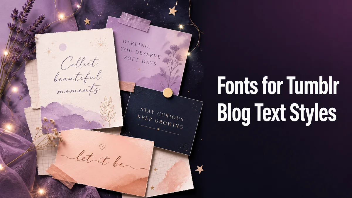
How do you use Tumblr fonts in a readable post?
Tumblr styling has to sit inside a theme, so make the text work with the blog title, post width, and mobile layout before you add extra decoration.
Step 1: Choose the blog element
Decide whether the text is a blog title, post heading, quote, tag, or image caption. Each element has a different amount of space and a different reason to stay searchable.
Step 2: Draft the phrase in plain letters
Keep the wording complete and check the spelling first. A normal source makes it easier to reuse the title across archive pages, links, and reblogs.
Step 3: Match style to the theme width
Use a compact letter treatment for narrow themes and a simple frame for a post heading. Wide or ornate alphabets can create unexpected wrapping on mobile.
Step 4: Review a published-style preview
Paste the result into the destination field or draft editor and look at it beside the theme. Remove any character that changes the line height or makes the tag difficult to read.
Which Tumblr text benefits from a font style?
A short title, series label, or mood line can use styling because readers see it before the main post. The subject, quote, and useful tags should remain ordinary.
This separation gives a series a repeatable look. Each post can share the same small heading treatment without turning the full archive into converted text.
Do Tumblr fonts stay consistent on every device?
A post may look different on a phone, browser, or reblog view. Wide letters can change the line length, and rare characters can become empty boxes.
Check the saved post on a narrow screen before using the style across a series. A simpler bold or frame option usually travels more reliably.
What are the advantages and disadvantages of Tumblr fonts?
A styled heading can mark a recurring series and help readers locate the main idea. It adds a visual change without requiring a new image.
Too much decoration makes long writing tiring and can hide tags or names. Keep the effect short and give the body text normal spacing.
Tumblr titles should survive reblogs
A Tumblr post can appear inside several themes, feeds, and reblog chains. Styled text that looks balanced on one blog may become too wide or too small when another theme displays it, so the safest decoration is short and self-contained.
Keep the core title recognizable when the post is separated from your profile. Readers often encounter a reblog without the original header, and a clear phrase helps them understand the topic in that context.
- Use a short heading instead of styling the full post.
- Keep tags in plain letters for reliable discovery.
- Check the line in both desktop and mobile widths.
Theme spacing changes the final result
Tumblr themes set their own font size, line height, margins, and overflow behavior. A full-width character set can force a title onto several lines even when the source phrase is short.
If the line feels crowded, remove outer symbols before changing the alphabet. This keeps the key words visible and gives the theme enough room to apply its own spacing.
Tip: Tumblr text needs to travel well between themes. Keep the title short, keep tags plain, and let one controlled style support the post instead of defining every line.
How should you keep a Tumblr series consistent?
Save the plain series title and the chosen styled version in the same note. Reuse the exact spelling so readers see a clear pattern from post to post.
If a new device changes the look, simplify the heading instead of changing every entry.
Save the normal title beside the styled version. Then check the post in the current theme, on a phone, and in a reblog view. If the line wraps or a tag becomes hard to use, shorten the decoration and keep the main words plain.
What should you confirm before using Fonts for Tumblr?
Use fancy text for a short Tumblr post title, quote opener, or mood line. Paste it into the post with the image or caption and check that the first words remain visible on mobile.
Keep the body text, tags, names, links, and instructions plain. A small repeated accent can connect a series without making the post difficult to scan or reblog.
Related tools: Aesthetic Fonts Generator , Fancy Bio Generator and Artistic Font Generator .