
What is a fonts changer tool?
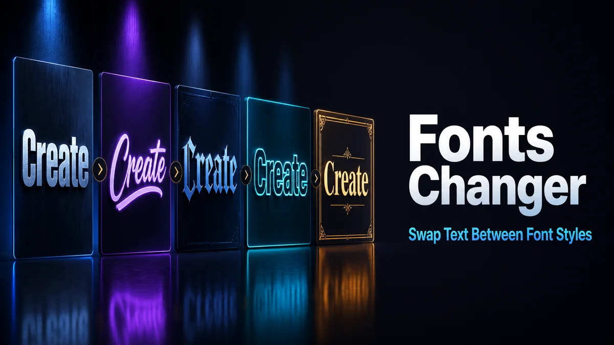
A fonts changer tool lets you compare the same phrase in several copied letter styles. It is useful when you know the message but still need to choose its width, weight, and visual tone.
Compare the actual phrase instead of trusting labels such as bold or script. The destination and the full line determine whether a style works.
How do you choose a fonts changer result for real use?
Style names can sound similar, but the converted phrase reveals the real difference in width, letter coverage, and readability.
Step 1: Enter the complete wording
Use the full name, heading, or caption line. A single sample letter cannot show whether the style handles every character in the phrase.
Step 2: Review the outer letters first
Look at the first and last letters, then check numbers and punctuation. These details often control whether the result feels balanced.
Step 3: Compare at destination size
Reduce the preview mentally or paste it into the real field. A style with fine details may lose them on a small profile row.
Step 4: Choose a fallback with the same mood
Keep a second option that uses a simpler alphabet or frame. It is easier to switch when the destination rejects a rare character.
What should you compare in a fonts changer?
Check the complete phrase, every letter, numbers, punctuation, and the width of the output. A one-word test can hide problems that appear in a longer line.
Read the result at the smallest display size. Frames are useful when the letter style changes recognition.
Do fonts changer results work on every device?
Device fonts can draw the same Unicode character with a different shape or width. Some letters may remain plain when a matching glyph is missing.
Paste and save the result in the real destination. Keep the ordinary phrase when the text needs search or editing.
What are the advantages and limits of a fonts changer?
The tool makes side-by-side comparison quick and helps you choose a style for a real phrase rather than a sample letter.
The most dramatic result is not always the most useful. Width, compatibility, and readable word shapes matter more.
Why can similar font names produce different results?
One style may replace letters with mathematical symbols, while another only changes spacing or adds a border. The labels can sound alike even though the two strings behave differently when copied into an app.
Compare the phrase itself and look for three details: does every character have a matching form, does the word remain recognisable, and does the output fit the field without extra wrapping?
- Read the full phrase rather than one showcase letter.
- Check the output with the numbers you will publish.
- Choose a frame when the alphabet becomes hard to read.
Font changes in names and profile headings
A profile name is often seen beside an image, a notification, or a small list. A compact treatment usually performs better than a wide style because the reader needs to identify the word immediately.
For a heading, one changed phrase can create enough contrast. The supporting sentence should stay plain so the reader does not have to decode every line.
Read the name on both a light and dark background if the destination places it over an image. A style that depends on fine details can disappear when the app reduces the text or changes the fallback font.
If two options are equally clear, choose the one that another person can type from memory. That small advantage matters when the name appears in an invite or support message.
Tip: Compare the phrase, not the label. The useful font change is the one that stays balanced, readable, and practical after the destination applies its own layout.
How should you keep a second fonts changer option ready?
Save one expressive option and one lighter option with the plain source. The lighter result can work when the first style is too wide or unsupported.
Use the destination field to make the final choice.
The preview only shows the starting point. The saved field decides the result.
Keeping both options also makes future edits easier because you can change the wording once and compare the same two visual treatments again.
Compare the complete phrase on a phone and in the real destination. Save one expressive choice and one lighter fallback, then keep the plain source so you can repeat the comparison after an edit.
What should you confirm before using Fonts Changer?
Use a fonts changer result for a short heading, profile line, or caption opener. Test the exact phrase in the real destination because a longer line can expose missing letters or uneven spacing.
Keep names, dates, links, and the explanation plain. Save one lighter option as a fallback when the first style is too wide or difficult to display.
Related tools: Font Changer , Fonts Converter and Font Copy Paste .